ABIGAIL CHESTER
U-M Precision Health
My role: user research, wireframe development and prototyping, UI design, usability testing
Results: Improved navigability of website, improved consistency throughout, clearly highlighted important features which differentiated the organization from its competitors


Overview
U-M Precision Health was my senior project in college at the University of Michigan. I worked with two of my peers to conduct a full iterative design process and redesign their website. The goal of this project was to gain experience on what a UX design project looks like from start to finish.
Background
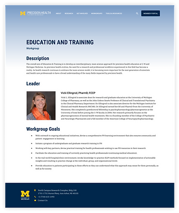
U-M Precision Health is an organization that researches novel ways to treat certain illnesses and implements those treatments into the public health care system. It is an organization on campus, and as a team we regularly met with the liaison to discuss project progress and goals.
Problem
Both the clients and the users expressed concern with the overall organization of the website– important features were difficult to find, the navigation bar was cluttered and not intuitive for users, and it took extensive time to really understand the purpose and goals of the organization itself.
Based off of the problems above, we came up with three project goals to keep in mind throughout the year-long project:

Clearly highlight the important features and goals of U-M Precision Health

Create a more consistent website overall

Differentiate U-M Precision Health from its competitors
Design Process
For this project, we used an iterative design process, focusing extensively on the research and testing phases in order to really understand our users and create a product that was perfect for their use. Here’s a roadmap of our process:
Research Phase
Before diving into the redesign, we as a team conducted user research using many different research methods in order to learn why the users came to the site, what features of the site they use the most often, and what pain points they experience. We conducted a stakeholder analysis, competitive analysis, subject matter interview, survey, card sort, and heuristic analysis in order to answer these questions.
The card sort was one of the methods that helped us to solve the issue of the navigability of the site. Our results showed that there were an excessive amount of navigation elements, a link to “Resources” was missing, and the subnavigation needed to be reorganized, as currently it didn’t make sense.
Research Results

Target Audience
We found that the main users of the site are public health researchers directly involved with the organization itself.

Purpose
The main purpose for the site is for researchers to input data about their projects, for students to find information about grants and scholarship programs, and for finding upcoming news and events relating to the organization.

Consistency
The heuristic analysis told us we needed to focus on the consistency between pages, eliminating the information overload, and making important links and pages more apparent.

Competitors
Competitors’ websites were well organized with minimal text and a simple navigation.
Design Phase
Before diving into initial sketches, we as a team decided that reorganizing the navigation was a crucial step in mitigating confusion when the user enters the site, as well as highlighting the important features, which was one of our initial project goals. Here’s the navigation we came up with:

Once the navigation was solidified, we put our main focus on the homepage redesign, as from our research we found users could not find important information on the homepage. We each then individually sketched out a couple ideas for the homepage, keeping in mind that we needed to include a button to get to the resources (Analytics Platform), a clear defining statement of the organization, and more photos. Then, we reconvened and collaborated with one another to put together all of our best ideas.
After we made our final sketch that included a few ideas from everyone, we went on to create a low fidelity wireframe of the homepage using Figma.

Goal #1
Clearly highlight the important features and goals of U-M Precision Health
Now that we had the homepage idea, it was time to expand the site by including the wireframe designs for the internal pages. Since the size of the website was large, but some of the pages had similar themes, we decided the most logical route to take would be to create templates for pages with similar content. So, we made templates for the category pages and the category detail pages. This way, we could not only develop the prototype more efficiently, but it would improve the consistency of the site.

Goal #2
Create a more consistent
website overall
After the wireframe was created, we shared with our peers and got feedback on our design. Based on the feedback, we made some tweaks to our design before entering the high fidelity prototyping phase. To make the high fidelity prototype, we added UI elements, making sure to abide by U of M’s brand and style guide. We added relevant photos, U-M Precision Health patterns, and other elements to pretty up our design and set our client apart from their competitors. Then, we prototyped the interactive elements on the page as well as between pages.
Goal #3
Differentiate U-M Precision Health from its competitors
I make it look quick and easy by showing you just the final wireframes and prototypes, but we revised the wireframes and the prototype over the course of a few months until we came up with this digital prototype:
Validation Phase
After the prototype was complete, we conducted usability tests to gain feedback on our changes to see how effective they were and if we needed to make further changes. Each of us conducted 5 in-person A/B tests with new, unbiased users. We had our participants complete three tasks on the current deployed site, and three similar tasks using our prototype.
We gathered both qualitative and quantitative data on our prototype to support our results. We asked our participants to complete a task (measured quantitatively by measuring time or steps taken) and followed up with a question about their opinions on the task completed (qualitative data). Our tasks correlated to our initial project goals to see if we hit the mark there. Here’s an example of one of the tasks we had them complete:

Overall, our results showed that on average, it took users 62.4 seconds faster and 1.6 fewer steps to find resources to help them gain an understanding of the organization. Participants found resources that were previously hidden 13.6 seconds faster and in 2 fewer steps. Participants were also able to navigate through our prototype more efficiently, finding pages and resources 57.2 seconds faster and in 2.6 fewer steps.


The results show that our redesign exceeded our goals and accomplished everything we set out to achieve, woohoo!
Important Features
Improved Information Architecture
The first thing we set out for after doing our user research was improving the navigability of the site. This starts with changing up the navigation to better fit the needs of the users. Using the information we gathered from the card sort, we were able to organize the navigation in a way that was more intuitive and clear to the user.
Why This is Important
Before the redesign, the navigation was cluttered and confusing. There were some really broad navigation elements, and also some really detailed ones, making it confusing for the user to know exactly where they wanted to go. Some pages were cluttered with information that could be split up, while other pages had little content on them at all. By rethinking the navigation, we were able to group pages more accordingly and leave less room for error for the user.
Hero Image Heading
When we designed the hero image, we made sure that the goals of U-M Precision Health were clearly visible and understandable. We also wanted to make it the center of attention above the fold so users would see the important information first and get a little synopsis on what the organization was all about.
Why This is Important
Before the redesign, the website included a slider of different projects they were working on. While that could be useful information for those who use the site often, newer users probably aren’t too familiar with the purpose and goals of U-M Precision Health, and would like a brief overview of what they’re about to learn on the site. Also, we wanted to omit the slider, since the slider looked like a bunch of ads, and not many people made it even past the first slide. There was a lot of information there that wasn’t utilized, so simplifying it with our hero created a good baseline of information for the users.
There are many other features that I didn’t highlight here, but the navigation was a huge component in our redesign that we spent a lot of time perfecting.
Learning & Takeaways
This year-long project was one of my favorite school assignments I have ever completed. It was something completely different to other projects, and getting to work alongside my peers with a client to deliver a prototype that we are all proud to use was a great experience. Working with a client mimicked how I would go about completing professional projects as a UX Designer, not just as a student. I learned in practice what design elements may or may not work depending on the site. This project has really inspired me to continue to learn about design principles and expand on the skills I already possess.